More than providing information about the products, modern-day advertising is all about forming a connection with the audience and building brand association. Brands are also compelled to catch people’s attention in mere seconds. This has created a shift to minimal ads. These are memorable, impactful, and enhance brand recall.
Let’s look at how brands are going about designing innovative and highly creative minimalist ads.
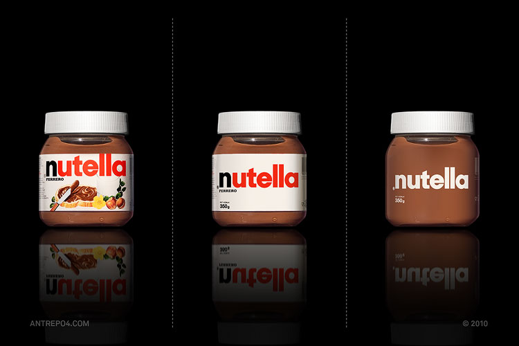
It’s important to find the perfect opportunity for your ad to be minimalist. Sometimes, giving out proper information is crucial, and not doing so might result in the opposite of your goal. When done right, it’s also possible to provide enough information simply.
This ad by Adidas is a nod to their iconic slippers, with the logo turning into the shape of the sandle. It’s a clever way of giving an accurate amount of information without saying much.

Another brand saying what they want through powerful imagery is Nivea promoting their night cream. Creating the shape of a moon using the Nivea cream box puts the emphasise on night. It is simple yet effective.

Similarly, Coca-Cola has used minimalist advertising to promote their new product – Coca-Cola Light Lemon – using a lemon peel to write the initial of their brand name in their very recognizable font. It’s not too hard to put two and two together and figure out the new flavor through only a single letter.

They came up with another impressive idea to introduce their bottles having a better grip. Merging the concept of minimalism with interactive advertising, they designed a truly ‘gripping’ ad by using velcro on bus-stand posters. This led to an increase in a 3.8% brand volume growth in France.

Minimalism can work surprisingly well while creating something more personal by keeping the ad interactive. Australia Post aproved this with a mirror shaped like a postage stamp to convey that people can personalize their post. This is a good example of how creating memorable ads does not require complex ideas.
Showcasing what your brand stands for can also be done through minimalistic ads. Especially when you want to reiterate the same thing in a creative way.
Lego simply used pieces of Lego blocks put together along with the shadows of things that inspired the shapes. It beautifully reflected their mission to develop the builders of tomorrow and to promote imagination

When seen from afar, it’ll look as if this ad features an image of a tomato. Only on closer inspection will one realize that Heinz has wittengly made their ketchup bottle to look like a tomato. This was done to accentuate the fact that the best selections of tomatoes are used in making their preservative-free ketchup.

Can an ad feature the product while also putting a spotlight on the brand’s tagline, all through a single minimal image? Kit-Kat says it’s possible. They’re known for designing smart and effective ads that never fail to catch the viewer’s attention. And they rose to the occasion once again by using their chocolate bars to form a pause sign, encouraging people to ‘Take a break and have a Kit-Kat.’

FedEx, for their brilliant ‘Purple to Orange’ campaign, used transitions between famous monuments from all over the world in their brand colors to illustrate their seamless transportation services.

When done with care, you can even use minimal advertising to highlight the functionality of your products or your brand’s value proposition.
Colgate promoted their floss by simply showing fruits with their seeds fallen around.

Dental hygiene brands seem to have sunk their teeth into creating minimal yet powerful ads. Using protective headgear to form teeth, Sensodyne emphasized how their products guard the user’s teeth. Seeing this ad is sure to create a lasting impression in a person’s mind.

How can one create a minimal ad that’s also humorous? San Disk demonstrates with their ad series that highlights that with their products, you can easily fit a large amount of data in a small space.

The pharmaceutical company, Bayer, is one more brand that combines humor with minimalism to promote their products. Their asprin ad series are clever and offer a chuckle by using word play to show situations that demand a normal vs a higher dose of the tablet.

It’s hardly possible to talk about impactful advertising without mentioning McDonalds. They always knock it out of the park with their well-thought out ads based on various techniques. They’re not far behind at nailing the less is more approach. This ad uses only spotlights on a billboard to form the classic ‘M’ alongwith the words ‘Open at night’. Nothing else is needed for a person to understand what the message is.

The logo and brand colors of the fast-food chain is so iconic and widely recognizable that they get a tonne of creative freedom to play with these and come up with phenomenal ideas. Over the years, however, they’ve gone even bigger and bolder with their ideas.
They went from using only half of their logos to close-ups of their food offerings and words arranged in the order of a burger to bring attention to their brand.

Minimalism can not just be used for advertising products, but also to market personas. Artists like Taylor Swift and Ariana Grande keep their album covers minimal, with only the album name, their face, and sometimes not even that!

As fascinating as minimal advertising is, it must be kept in mind that a certain degree of brand recognition is needed to make an impact. It’s also important to see the ad from an outsider’s point of view and ensure what is making sense to you will also be easily understandable by them.
If you watch advertisements more than a TV show, scout newspapers for interesting ads, and have it in you to make an impact in the media industry with your skills, you need to check out our School of Contemporary Media. The courses we offer will help you navigate the modern media and build a successful career for yourself. For more information, click here.