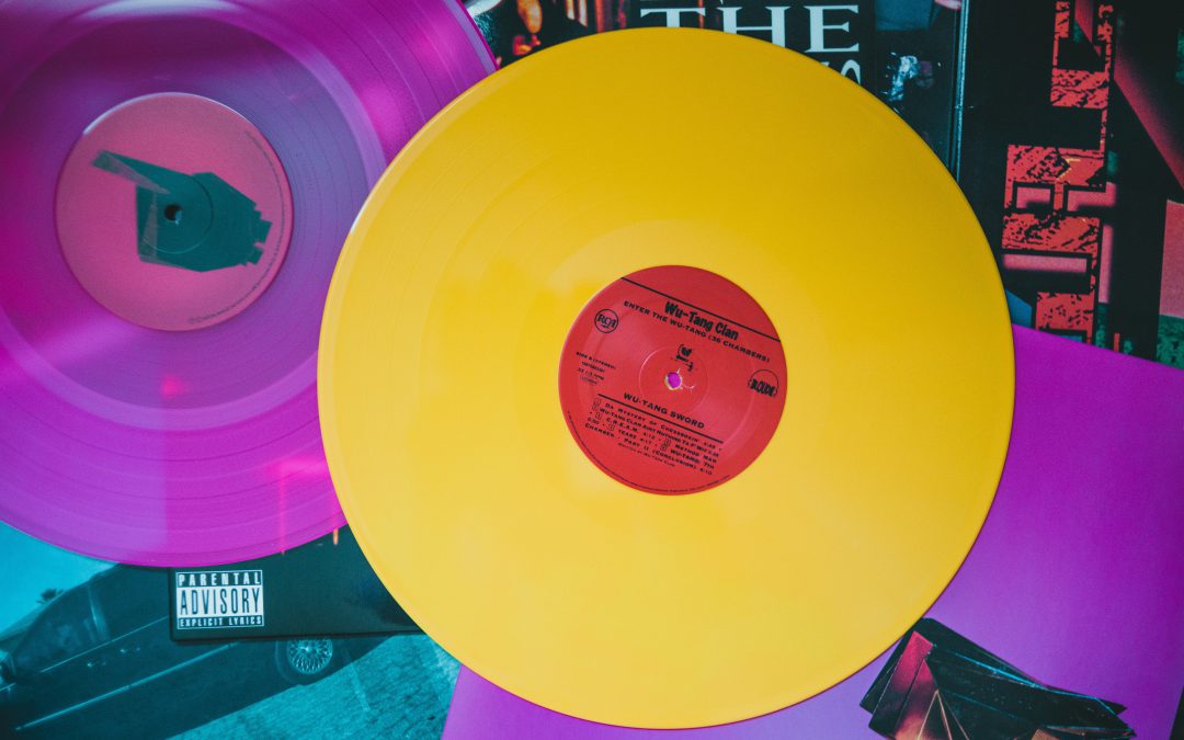
Imagine this – you’re walking through the valleys of a grunge record store, flipping through music albums to decide which one you’ll be taking home. You come across an artwork that immediately catches your eye and immerses you in a different universe before you have even started listening to the music. That is the true power of album artwork. While record stores and vinyls may be a thing of the past, music album covers remain relevant in an age of online streaming and downloads.
Covers have always been a crucial element to any form of media whether it be books, movies or games. However, music is a space where an artist can experiment limitlessly with various media to create the perfect visual companion for a listener’s musical journey.
How it all started
Essentially meant to serve the utilitarian purpose of protecting a record, album covers became a form of artwork in 1983 when a music label, Columbia Records hired their first art director, Alex Steinweiss to conceptualize and design album covers. Other labels and artists were soon to jump on the bandwagon.

Ingredients of an iconic album cover
What comes to your mind when you think of iconic album covers?
It may be Andy Warhol’s artwork of a peelable banana for The Velvet Underground and Nico (1967), The classic picture of The Beatles walking down the street for Abbey Road (1969) or the simple yet unforgettable visual of a prism diffraction against a black backdrop in Dark Side Of The Moon by Pink Floyd (1973).
Whatever your answer might be, one thing is clear. A secret to a remarkable album cover is the ability to encapsulate what music feels into one image. Let’s take a look at how it’s done!

Simply art
Some covers play around with elements of design such as appealing color palettes, unusual typography, implied textures and use of space to evoke any kind of emotion a musician wants their audience to feel. Phoebe Bridgers’ Punisher(2020) and Lorde’s Melodrama (2017) are great examples of a soul-stirring color-scheme where the former feels apocalyptic and the latter is melancholic. The kaleidoscopic cover of Watch the Throne(2011) uses motifs and gold embossings that exhibit grandeur and opulence reflected in the music. Currents by Tame Impala(2015) showcases a turbulent flow with use of distorted lines, electric pinks, purples and silver reflecting the psychedelic vibes of his music.

Game of Genre
You can take one look at the art on the cover and define the music genre. This is because covers perfectly capture the essence of the time and era it was created in. Hip-Hop albums like To Pimp a Butterfly (2015) and Madvillainy (2004) are often in blacks, whites and grays while Jazz albums are monochromatic with a vintage aesthetic. On another hand, R&B brings out the dramatic energy through portraits of musicians like Michael Jackson in Thriller (1982). With genres like rock and punk, artists get to indulge more in abstract art with surrealist concepts focussing on generating intrigue amongst listeners. The iconic image in Nevermind by Nirvana of a baby chasing a dollar underwater does exactly that!

The true persona
Some covers solely focus on how the artist wants to define themselves. It may be through eccentric makeup looks, unique camera angles or unconventional costume designs. In Janelle Monáe’s Dirty Computer (2018) she portrays herself as extravagant with a clashing contrast of warm and cool colors. Musical legend, Prince gives us a background into his bold yet sensual personality through the album cover of Purple Rain (1984).

Behind the covers
The purpose of a good album cover is to relay the message behind it in the most engaging way. From satirical take on political issues to personal anecdotes, covers provide a challenge for listeners to decode musical quintessence before diving deep into it. Photomontage cover of Sgt. Pepper’s Lonely Heart Club(1967) by The Beatles pays homage to their inspirations while at the same time mixes high and low culture and challenges feelings of unity. Another notable spellbinding cover is of Wish You Were Here(1975) by Pink Floyd portrays the dangers of two-faced emotions in a cinematic way and Titanic Rising(2019) symbolizing a subconscious realm of sentiment and nostalgia.
Music may be the ultimate tipping point in deciding whether the album is good or not. But there is no denying that the design surrounding the music gives a direction to our feelings taking the audio-visual journey to another level. Revisit your favorite album cover and see what new you can uncover!
If you are fascinated by design and wish to transcend boundaries with your creative ideas, Pearl Academy is the place to be. Our various design courses such as Communication Design, Interaction Design, Product Design, and more, will help you become an expert in your field. Find out more about the courses offered here


