As the virtual world becomes the go-to for brands to attract customers, it’s crucial to bring impeccable experiences for them. A well-designed website can help attract customers and hook them when the warmth brought forth by face-to-face interaction is not possible. An intuitive UX journey for the customer goes a long way in building a connection, evoking interest in your offerings, and a highly increased chance of another visit. The user experience needs to showcase your products while effectively communicating the value addition they’re bringing to the consumer’s life. Good UX can predict their next move and is always a step ahead.
Here are some websites that are way ahead in their UX game, making the whole process feel like a well-coordinated dance.
1. Zomato
The food delivery app has kept user experience in mind every step of the way. They’ve very effectively used illustrations to make the website user-friendly. Throughout their website (or the phone app, for that matter), there are icons to portray useful information such as price points of a restaurant, customer ratings, etc. From food reviews to pictures to delivery details, they ensure that the customers get what they see and pay for. And their aim to deliver satisfaction never missed the spot.

2. MFine
MFine’s interface is dynamic, easy-on-the-eye, and interesting all at the same time. It categorizes information in a manner that can be navigated effortlessly. Each specialization is perfectly segmented, and the menu serves as a guide to the different requirements a user might have

3. Disney+
By segregating Disney’s five main brands and depicting them on the homepage in clear icons, Disney+ has taken their landing page up a notch. This enhances the experience for users and makes them stand apart from the other streaming platforms. It also deploys a brilliant error prevention technique by sending prompts to make the search process completely flawless.

4. Booking.com/ Airbnb
Travel websites ensure not only seamless journeys for travelers but also a seamless experience while navigating their websites. Both Booking.com and Airbnb are dedicated to simplifying traveler’s experience by compressing tons of information and presenting it in a compact manner marked by minimalistic design. The consistency of the interface creates welcoming predictability nudging the user to visit again.

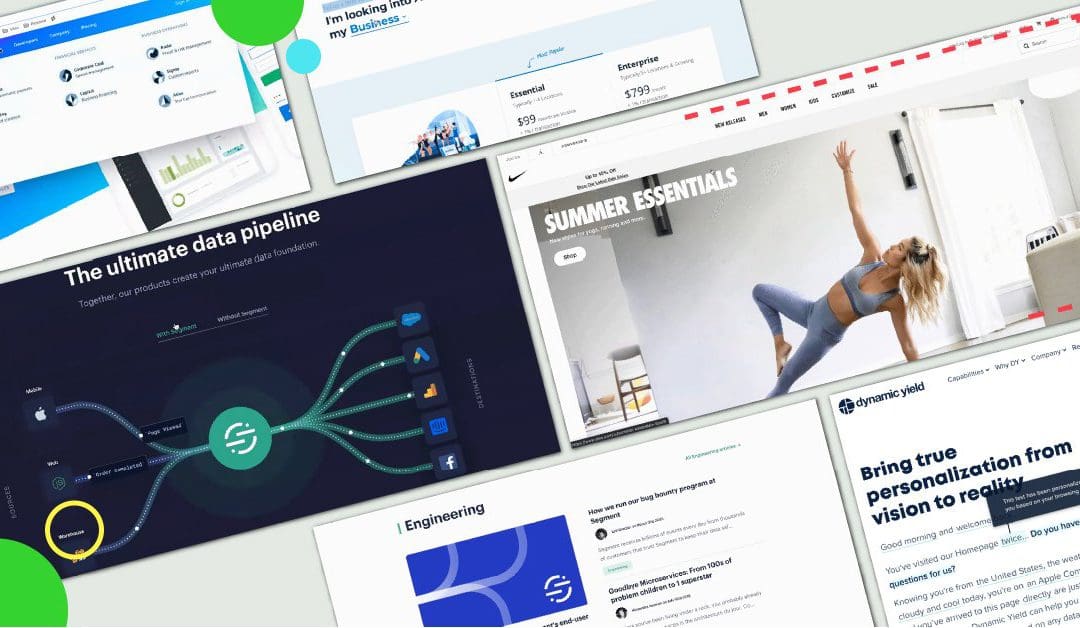
5. Nike
Nike has set the bar high for e-commerce websites. Their UX design compels users to add products to the cart and swiftly check them out. The layout of the product page is fuss-free, with all the necessary information right in front of the eyes. It allows you to look at the pictures, read its specifications, and choose the size all in one go, making the selection process a walk in the park.

An effective UX is the key to get an edge and engage your audiences. Designing the perfect UX often requires creativity, strategy, and the ability to think from the user’s perspective. If you have the artistic abilities to take a website to the next level, Pearl Academy can help you hone your skills and sharpen your intuition. We bring together top industry experts who’ll give you insights curated from their rich experience and enable you to flourish in your career right from the get-go. Find out more about our Interaction Design course here.